
Thoughtfully created to help you choose colors with clarity, confidence, and timeless elegance.
A Warm Welcome
If this is your first time working with an interior designer, you are not alone. Many of our clients arrive feeling excited, curious, and sometimes a little unsure about where to begin. Our role is to guide you with clarity, care, and professional expertise—making the process enjoyable, collaborative, and truly tailored to your life.
Color design does not rely on rigid or intimidating rules. The principles in this guide are simply tools to help us make thoughtful decisions more easily and confidently. They exist to support creativity, not limit it.
And if you ever find yourself loving two colors that do not seem to work well together in the same space, there is always a simple and elegant solution: allow each color to live beautifully in a different room. This approach keeps harmony throughout the home while still honoring everything you love.

1. The Golden Balance Rule (60–30–10)
This simple principle creates harmony and visual comfort in any room.
- 60% Main Color – walls, large rugs, main cabinetry
- 30% Secondary Color – sofas, curtains, feature furniture
- 10% Accent Color – cushions, art, décor, accessories
Example: – Warm beige walls (60%) – Olive green sofa or curtains (30%) – Terracotta cushions or décor (10%)
Our studio uses this rule as a foundation to ensure spaces feel balanced, calm, and beautifully composed.

2. Calm & Elegant: Tonal Layering
Working within the same color family—through lighter and deeper shades—creates a refined and peaceful atmosphere.
Example palette: – Sand walls – Taupe sofa – Chocolate brown accents – Brass or bronze details
Ideal for living rooms, bedrooms, and warm contemporary interiors where comfort meets quiet luxury.

3. Adding Energy: Complementary Colors
Complementary tones sit opposite on the color wheel and introduce depth, contrast, and personality.
Designer‑approved pairings: – Deep teal + burnt orange – Olive green + muted red – Navy blue + warm mustard
Studio tip: We apply contrast in carefully measured accents rather than large surfaces to keep the result sophisticated and timeless.

4. Soft & Natural: Analogous Colors
Analogous palettes use neighboring hues to create a seamless, calming flow.
Examples: – Green → olive → mustard – Blue → teal → soft green
Perfect for serene bedrooms and nature‑inspired interiors designed for everyday wellbeing.
5. Warm vs. Cool Balance
Beautiful interiors balance warmth and freshness.
- Warm elements: wood, rust, terracotta, beige, brass
- Cool elements: gray stone, blue tones, marble, black accents
Our approach: – If a space feels too cool → we introduce wood, layered textiles, or warm metals. – If it feels too warm → we refine the palette with stone tones, soft blues, or sculptural black accents.
This balance is key to creating interiors that feel welcoming year‑round.
6. Start with Neutrals, Then Add Personality
Timeless homes are built on a calm neutral base.
- 70–80% neutral foundation (whites, beiges, greiges, soft grays)
- 20–30% expressive color (green, blue, terracotta, mustard, and more)
This method keeps your space elegant, flexible, and easy to evolve with time.

7. Materials Also Create Color
- Walnut wood brings natural warmth
In refined interior design, materials are as important as paint.
- Linen softens and lightens neutrals
- Marble introduces cool contrast and sophistication
- Metal finishes (brass, bronze, black) shape the overall mood
Our studio carefully composes these layers to achieve depth, harmony, and longevity.

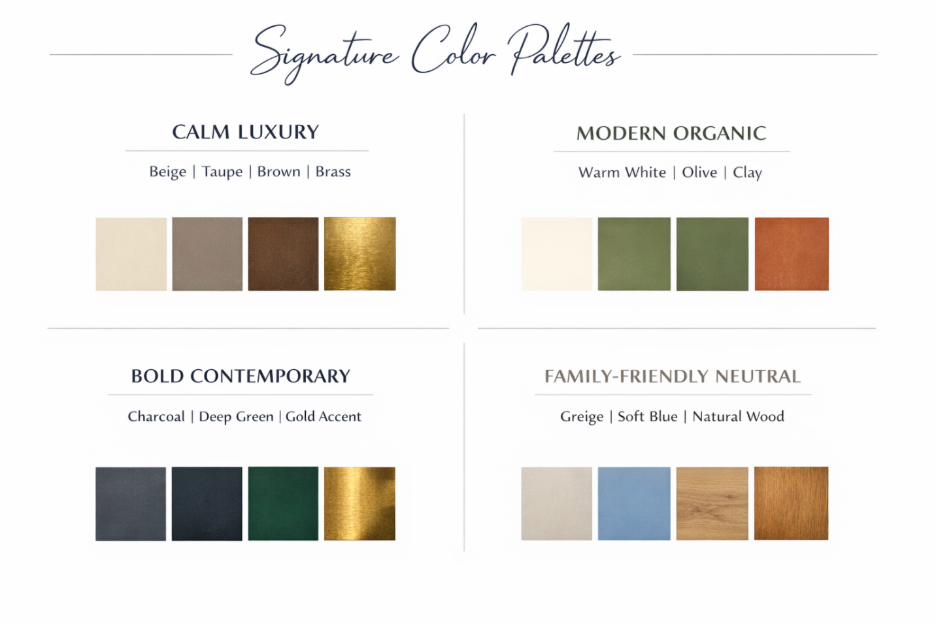
Signature Color Palettes
Before we explore the palettes below, you might be wondering where to begin—or simply wishing to see a few elegant examples already thoughtfully composed. The following combinations are timeless, balanced, and designed to offer a clear starting point for your home.
Feel free to use them exactly as they are, or adapt them to better reflect your personal taste. You may also substitute the accent color with another tone that harmonizes with the same palette, allowing flexibility while preserving overall elegance and cohesion.
Calm Luxury
Beige · Taupe · Warm Brown · Brass
Modern Organic
Warm White · Olive Green · Clay · Natural Wood
Bold Contemporary
Charcoal · Deep Green · Black · Gold Accent
Soft Family Neutral
Greige · Dusty Blue · Light Wood · Cream

A Final Word
Great color design is not about strict rules—it is about creating a home that feels calm, meaningful, and uniquely yours.
At The Creative Design we guide you through every decision—from colors and materials to the smallest finishing details—so your home reflects both beauty and the way you truly live.
For personalized support or to begin your project, we would be delighted to assist you.
Wishing you a creative dream to your new space,
Juliana (shhh, check below some extra palettes)
PS: Additional Palettes by Mood
To further inspire your vision, here are a few curated palettes organized by the atmosphere they create. Each mood offers a different emotional experience while maintaining elegance and timeless appeal.
Warm
Soft Beige · Honey Wood · Terracotta · Warm Brass
A comforting and inviting palette ideal for living rooms and family spaces where warmth and connection are the priority.
Fresh
Ivory · Sage Green · Soft Blue · Light Oak
Light, airy, and calming—perfect for bedrooms, bathrooms, or homes that seek a sense of openness and tranquillity.
Dramatic
Deep Charcoal · Espresso Brown · Forest Green · Antique Gold
Rich and sophisticated, this palette creates depth and impact, beautifully suited for dining rooms, feature walls, or statement interiors.
Serene
Warm White · Mist Gray · Dusty Blue · Pale Sand
Gentle and restful, designed for peaceful environments that support relaxation and everyday wellbeing.
Wishing you a creative dream for your new space,
Juliana